Website designers must consider the feelings that their site evokes. It's not enough to ensure that a website conveys the message you want to convey. Sites that do not generate an emotional response are forgotten soon. You must consider human emotions when creating your website.
# No.1 Make use of color psychology

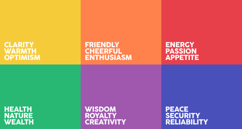
The psychology of colors
Color psychology is an effective tool which has notably contributed to the success of thousands of e-commerce businesses. Different hues convey different messages, the relation between human emotion and color has been proved by many dedicated surveys. To apply this beautiful coloring effect to your store, firstly, take time to define and pick your own color and its palette. For example, if your target is cosmetic, a soft and vivid tone or pastel accent that reflects serenity and optimism will probably convey emotions better than black or other dark tones.
#No.2 Appropriate selection of concept for your e-commerce store
You'll need a website design concept before you start hunting for potential customers. You must choose what appeals to your target audience and the message you wish to convey. You wouldn't try crossing a continent without a map; though you might get there, getting there will be much more difficult than if you had a strategy in the first place.

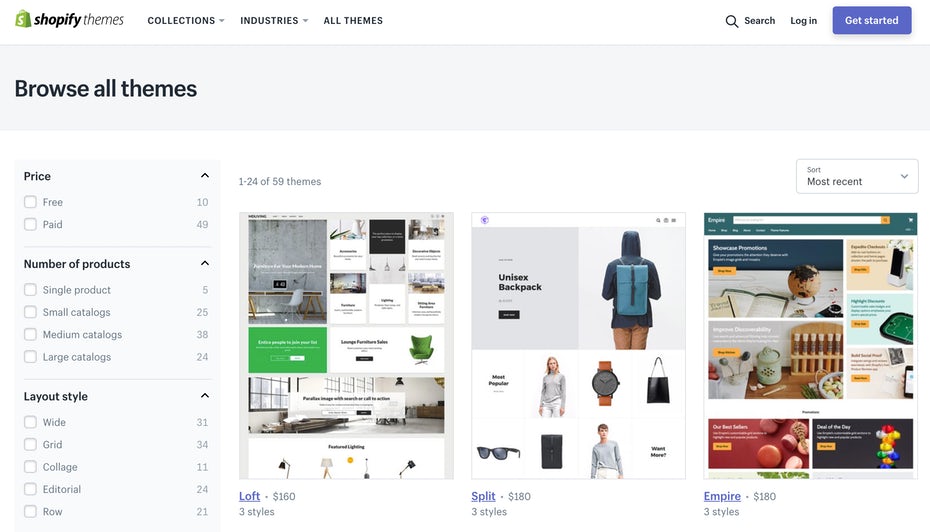
Stunning theme for e-commerce store from Shopify
When creating a website concept, you must think about a variety of things, including:
The message you want to get through.
Your company's image
The design elements that will aid in getting your message to your target buyers.
What design elements would detract from the message?
#No.3 Consistent message across all media
On a website, everything should serve some purpose. Visitors are irritated by meaningless system design. Any design decisions you make will have an emotional impact on your users. Simplify their and your lives by associating a clear meaning from the start. Sending a clear message requires a lot of consistency. Consistency in web design entails more than ensuring that text does not contradict itself. It means that all of the pieces on a page are in sync and fit your brand.

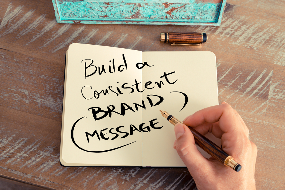
Maintain consistent brand message
Across all platforms, there should be consistency. Use your logo on your website, in e-mail messages, and on social media accounts at all times so that it is always connected with your business. That link can be hugely helpful, especially if you have worked hard to develop a consistent social image. A logo that is repeatedly employed can eventually evoke significance on its own.
#No. 4 Emotion with purpose
Understand the emotional purpose and utility of each design decision you make, or a bad decision could come back to bite you.

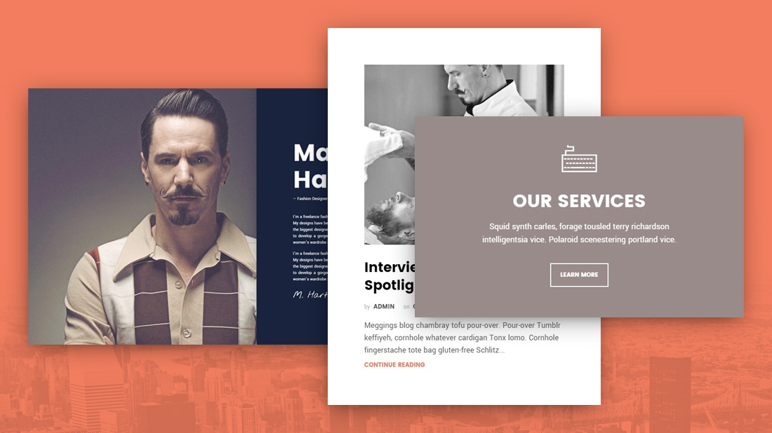
Awesome website design
Check that all of the various elements, as well as your message, fit properly when putting the website together. A haphazard mix gives any website a sloppy appearance. While you may be tempted to give up, the line between simplicity and boredom is thin. Between enthusiasm and perplexity, there is an equally delicate line.
Double-check that your page is on the right side of the divide. Consider employing a design team if you need assistance creating an evocative website. Designers can help you send the message you want to deliver swiftly and effectively since they are familiar with all of the important details.

